When Jennifer Sagum embarked on a gut renovation of her family’s Williamsburg home, she need not look far for inspiration. Having spent the past eighteen years immersed in the world of Marc Jacobs, she drew upon her keen eye and fashion sensibility to inform the creative process. “I’ve been vintage shopping since I was in 7th grade…I wear a lot of Marc and mix it with vintage. That’s how I wanted my home to be,” the VP of Global Advertising & Media shares. To curate the perfect mix of old and new, Sagum turned to interior designer and vintage dealer Jennifer Chused of Chused & Co. Like Sagum, Chused began her career in fashion—first at Donna Karan and later at publications like Italian Vogue, Vanity Fair, and Elle. “The house is very fashion,” remarks Chused, who referenced Sagum’s own style of dressing as a source of inspiration. The pair hit it off and worked together to create a space that celebrates pattern and whimsy in a sophisticated way.
Before Chused arrived at the scene, Sagum and her husband Brian Moss enlisted the help of Glickman Schlesinger Architects to “bring [the corner property] back to what it originally was.” The renovation took a bit more than a year. At one point, only two walls and a façade remained. Sagum describes the project as “a labor of love” featuring special touches from friends—architects, photographers, artists, and purveyors of handmade hardware.
IT’S ALL IN THE DETAILS
Photo: Sarah Elliot, Courtesy of Chused & Co
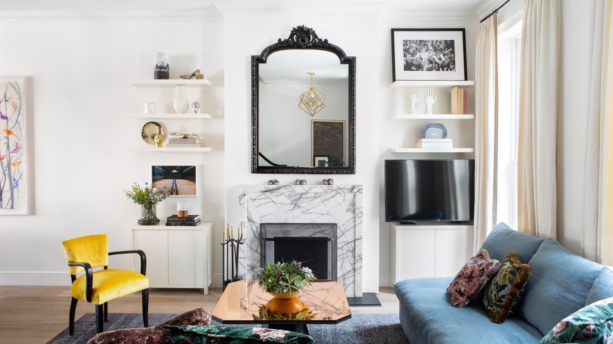
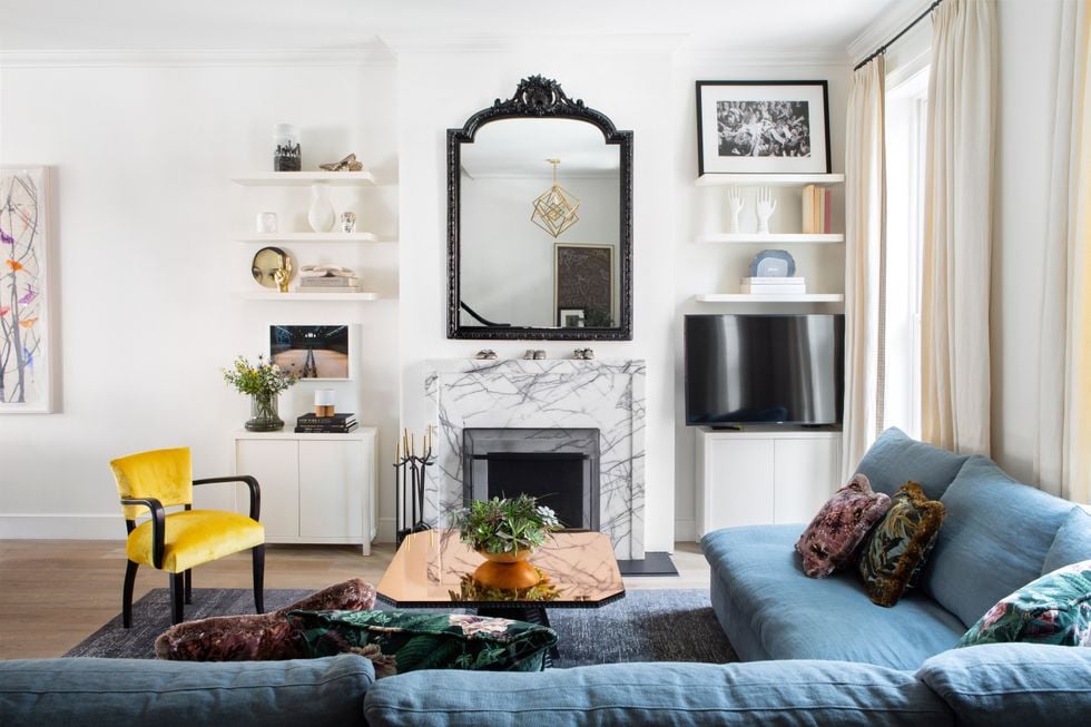
From the start, Chused and Sagum were aligned in their desire to mix old and new—a philosophy that’s on display in the home’s living room. Here, a vintage coffee table sits alongside a Restoration Hardware couch. The pair made sure to add one-of-a-kind touches to otherwise ordinary pieces. Chused modified the Restoration Hardware curtains with ribbon trim so “they don’t look off the shelf” and upholstered Sagum’s own vintage chair in Yellow Silk Velvet from Pierre Frey. Sagum also made sure to inject personality into each space with selections from her collection of artwork and photographs. Her favorite object in the home is a vintage Lance Mercer photograph that features her fourteen-year-old self alongside Eddie Vedder at a Pearl Jam concert. The framed piece, which was a surprise from her husband, sits atop a living room shelf.
MODERN YET FEMININE
Photo: Sarah Elliot, Courtesy of Chused & Co
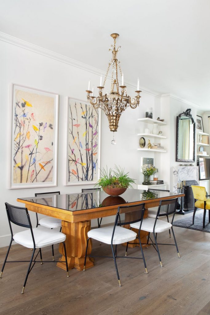
“Modern yet feminine” is how Chused describes the open living area—a space she also dubs the home’s biggest decorating challenge. Her solution for the long, rectangular room: divide it into three distinct spaces, using artwork to highlight the dining area and a rug of her own design to distinguish the sitting area.
AN IKEA UPGRADE
Photo: Sarah Elliot, Courtesy of Chused & Co
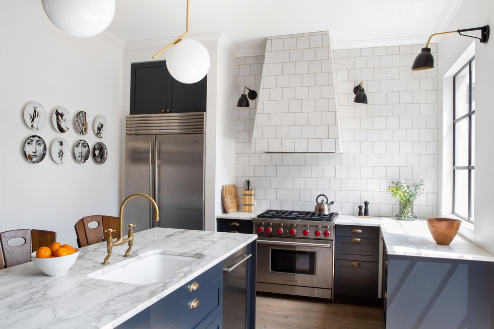
Polished and cool, the kitchen boasts a sleek appearance that contrasts some of the home’s more whimsical nooks. The bones for the space, believe it or not, came from Ikea. “I was glued to Pinterest,” Sagum shares. She used semi-handmade fronts to give the Ikea materials a facelift, along with hardware from Sun Valley Bronze—a luxury hardware company that’s run by her college BFF.
A POP OF PURPLE
Photo: Sarah Elliot, Courtesy of Chused & Co
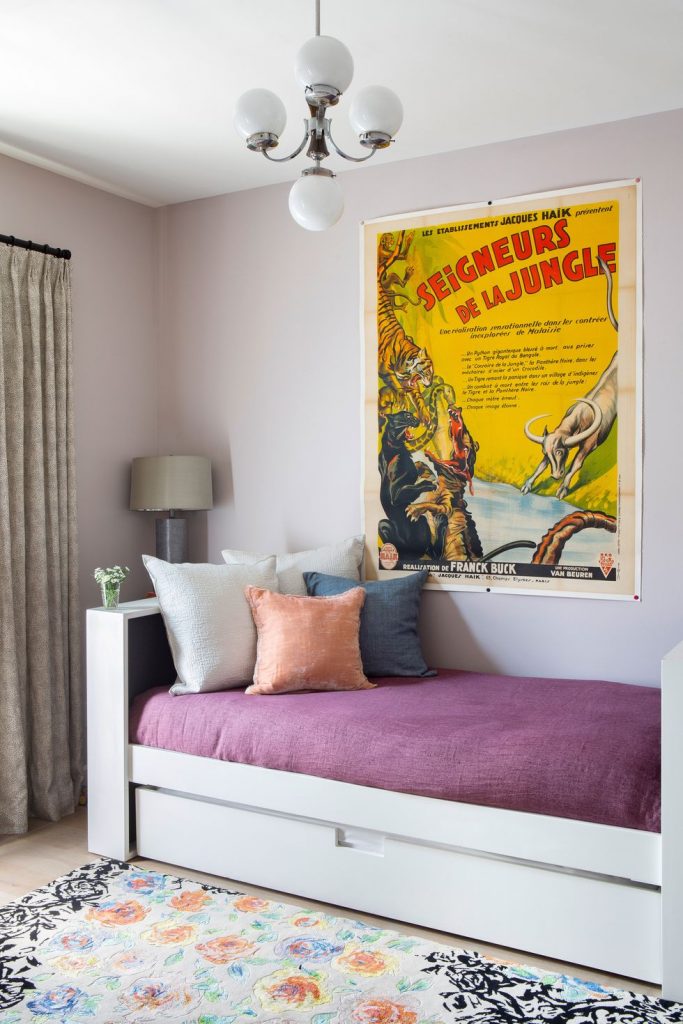
When decorating the bedrooms of Sagum’s three daughters, Chused prioritized storage. “Any child can be taught to respect the things they live with…but the number one thing to think about is: where are they going to put them?” The first bedroom, pictured above, features a storage bed dressed in a medley of bright linens from ABC Carpet and Home. Chused pulled her palatte from the rug and the artwork; “I decided to pop it with purple.” She finished the room with Kelly Wearstler curtains.
PLAYFUL MIXING
Photo: Sarah Elliot, Courtesy of Chused & Co
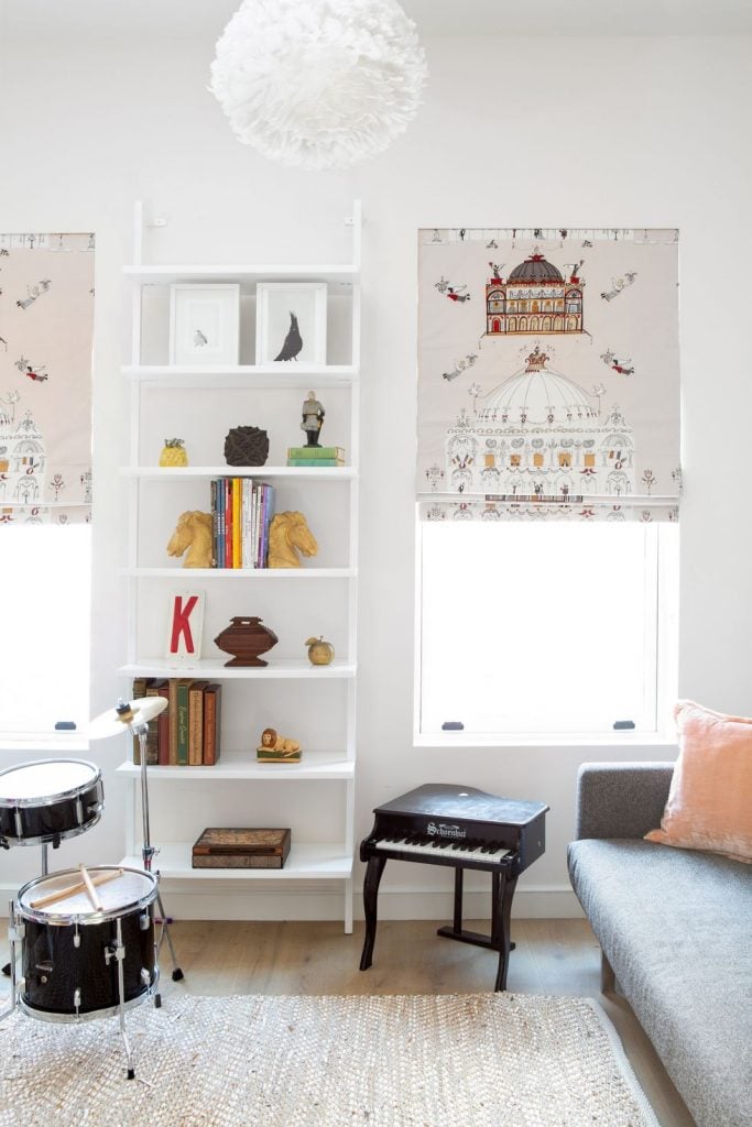
Chused also employed the art of high-low mixing for the childrens’ rooms. She and Sagum both knew that the Scuhmacher fabric was going to steal the show in this bedroom, so they splurged on the custom shades. The feather light fixture was purchased from Wayfair. “It makes the room and it’s under 100 dollars,” shares the designer. The CB2 shelves are dotted with flea market finds from Chused, a self-proclaimed vintage expert (check out her 1stdibs shop here).
PATTERN WITH PERSONALITY
Photo: Sarah Elliot, Courtesy of Chused & Co
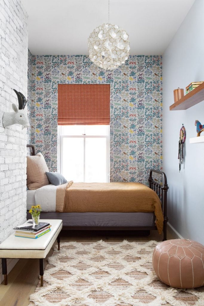
The interior designer wanted to ensure that each bedroom maintained a personality of its own. She applied one of Sagum’s favorite pattern picks to the walls of the third bedroom. “Wallpapering the whole room would have been expensive, so I wrapped the paper to the brick.” Chused recommends a change in material when beginning or ending a section of wallcovering. She finished the space with a vintage bench from eBay, a West Elm light fixture, and an Anthropologie rug. For kids, “I try to choose a duvet with some substance so it always looks clean and neat.”
A CHIC ESCAPE
Photo: Sarah Elliot, Courtesy of Chused & Co
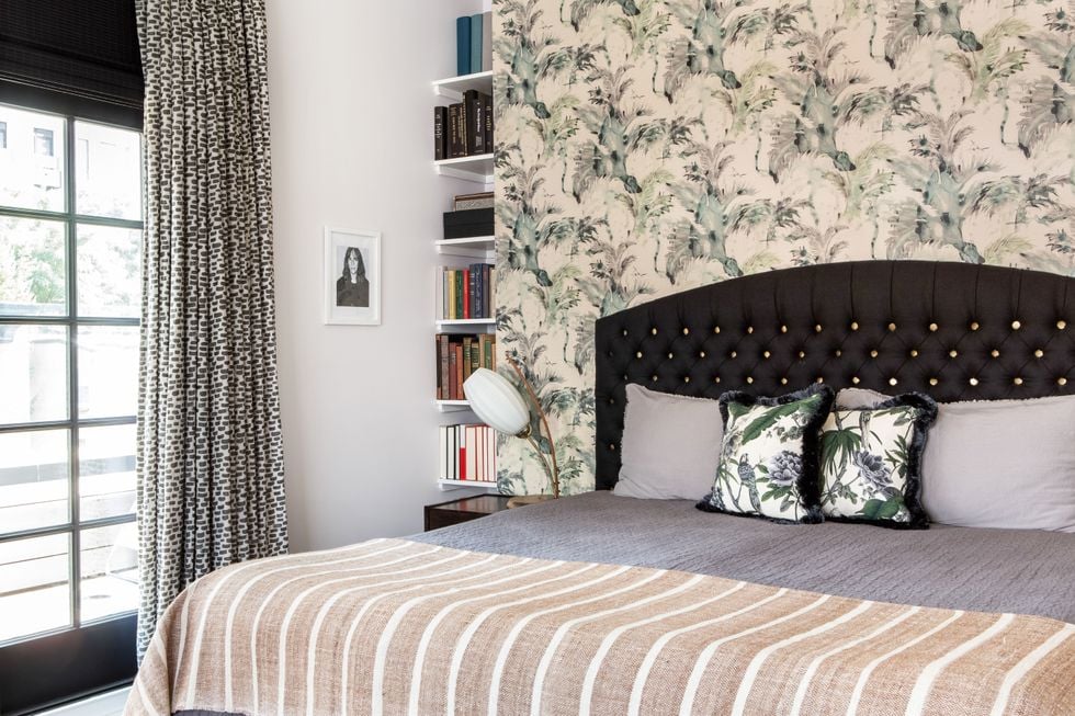
Upstairs in the master bedroom, Sagum fell in love with a grasscloth wallcovering from Eskayel. Chused paired this selection with a black linen headboard from Nicky Kehoe, vintage lamps, side tables from Anthropologie, and throw pillows from Bergdorf Goodman.
VINTAGE STEALS THE SHOW
Photo: Sarah Elliot, Courtesy of Chused & Co
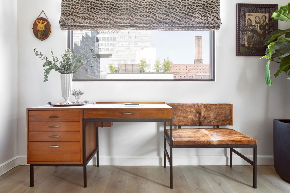
Two of the master bedroom’s greatest features sit opposite the bed: a vintage cowhide desk from the 50s (it’s all one piece!) and a picture window overlooking the East River. The Clay McLaurin window treatments pick up the colors from the patterned accent wall.
A MASTER BATH WITH CHARM
Photo: Sarah Elliot, Courtesy of Chused & Co
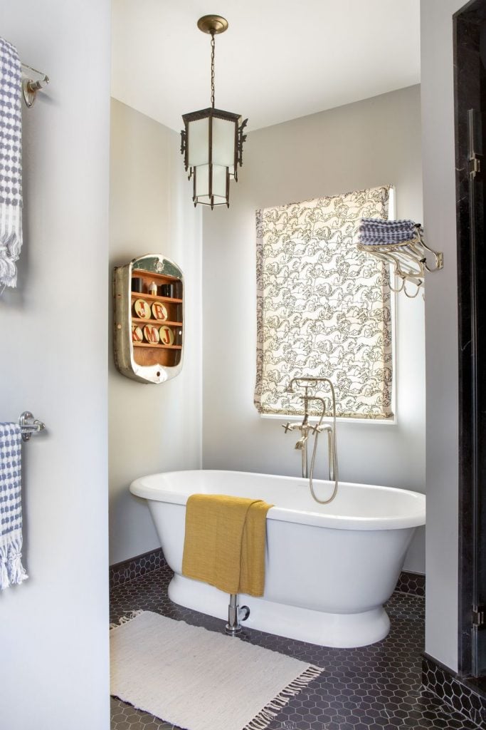
In the master bathroom, Chused and Sagum found another opportunity to juxtapose old and new elements. They selected a vintage light fixture from Olde Good Things and a Florence Broadhurst pattern for the window treatments.
A SECOND FAMILY ROOM
Photo: Sarah Elliot, Courtesy of Chused & Co
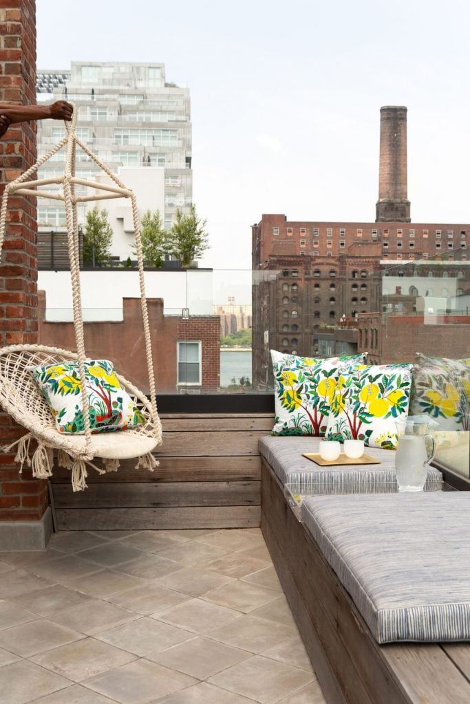
The home’s best kept secret sits directly off the master bedroom, offering views of Manhattan, the East River, and the Domino Sugar Refinery. The terrace serves as the site of countless family picnics, so Chused outfitted the bench with four or five small cushions, rather than a bench cushion, to offer flexibility. Both the macramé chair and the outdoor pillows in Josef Frank’s Citrus Garden fabric offer a playfulness that’s consistent with the rest of the duo’s design choices. The outdoor space epitomizes the idyllic family home that Sagum and her husband set out to create.
When asked if she has any additional design tweaks she’d like to make to the home, Sagum shares her plans to fill the terrace with greenery for the summer months. And her eldest daughter recently selected new artwork for her bedroom. Naturally, Sagum and her daughter consulted Chused when deciding on the scale and placement of the works. The acquisitions: two black and white photos by Lynette Garland from behind-the-scenes at Marc Jacobs’ fall 2019 show. Stylish living, it seems, is a family affair.
This piece was produced in partnership with Refinery29.

