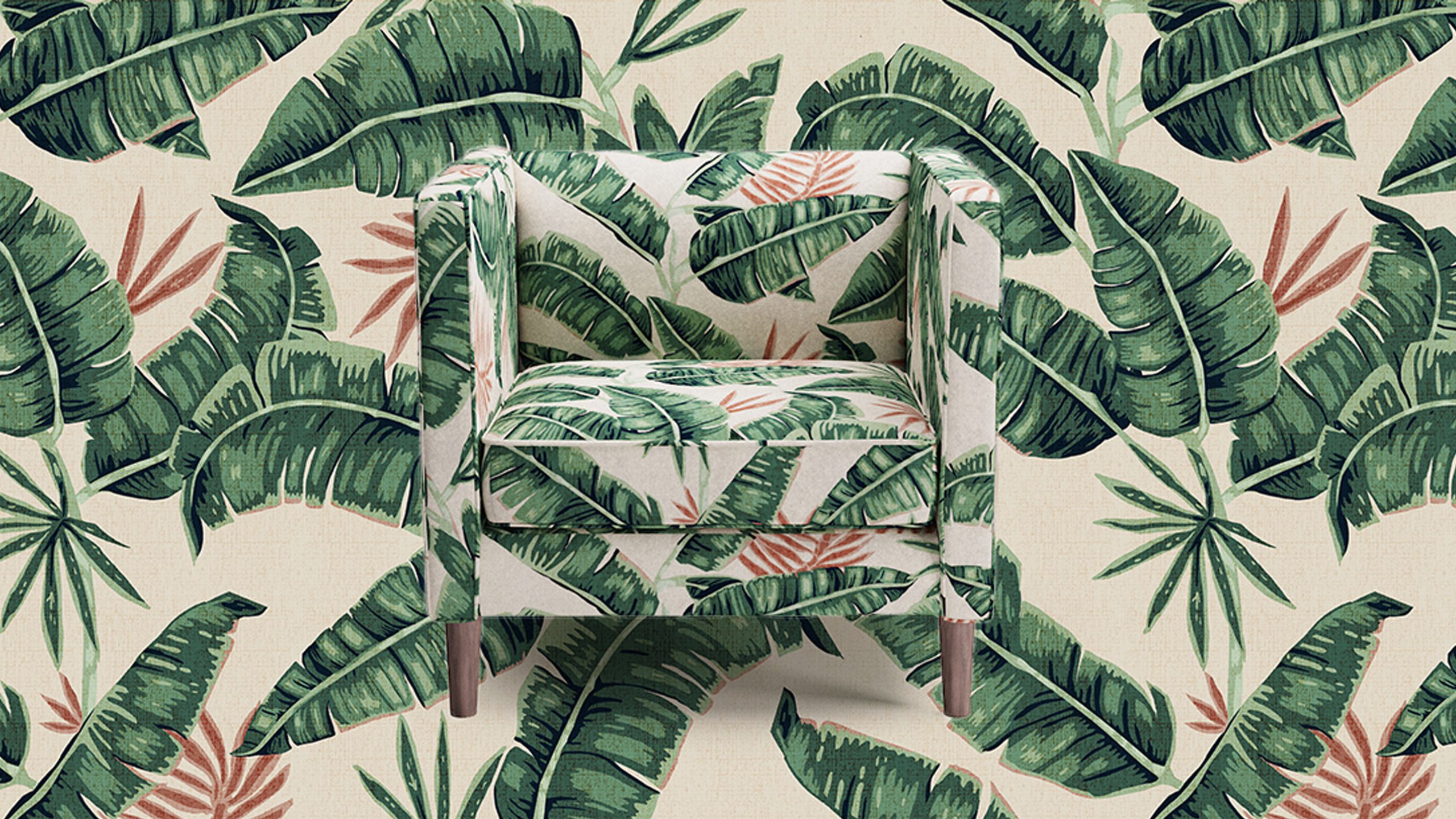
Banana Palm: the print that recalls tropical paradises and makes you feel instantly happy. The iconic print’s history is (no surprise) pretty fabulous, so we asked one of the most fabulous interior designers we know to mix it three ways.
POSTMODERN PARADISE
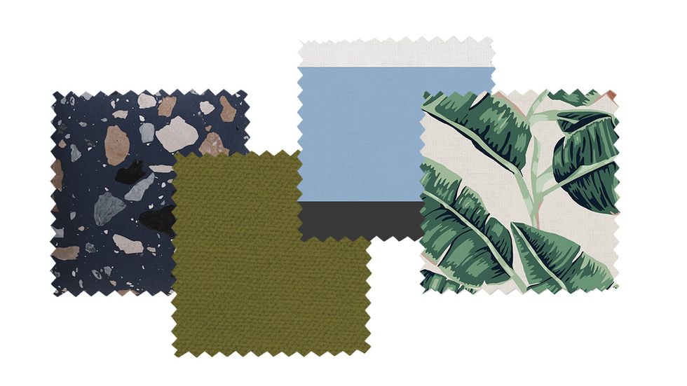
Swatches: Deep Blue Sperduti, Moss Velvet, Blue Color Block Stripe by Peter Som, Banana Palm
For her first story, Galli chose “three very different patterns connected by a palette of navy, green and earth tones.” We love how she treats the leafy motif like a postmodern print, pairing it with our terrazzo-inspired Sperduti pattern, an oversized color block stripe by Peter Som, and an injection of moss green. “The power of the clash keeps everything vital and vibrant. A range of visual textures keeps the eye moving and excited,” Galli remarks. Overall, this mix feels very cool and unexpected.
ETERNAL VACATION VIBES
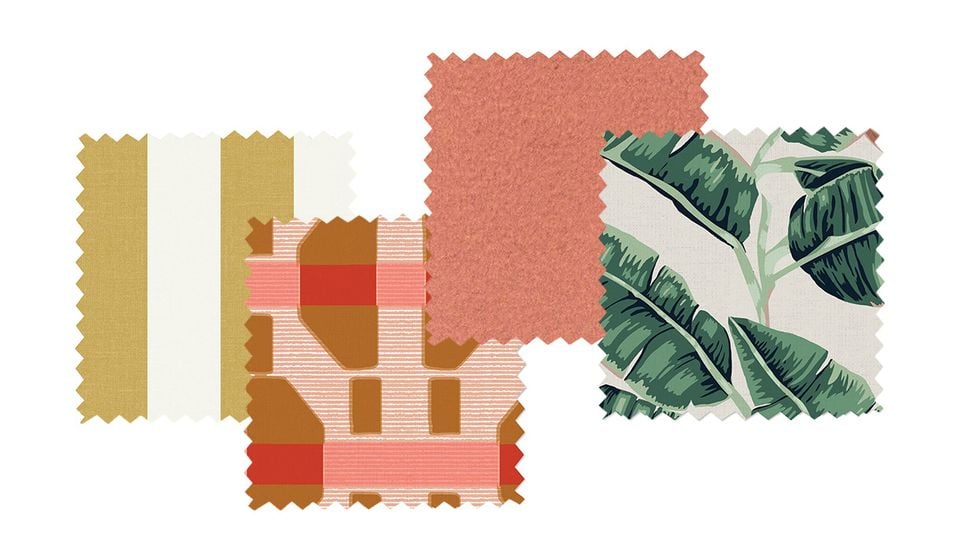
Swatches: Citrine Cabana Stripe, Blush Poppy Corsica by Christene Barberich, Coral Velvet, Banana Palm
As you already know, 2019 is all about coral. Here, Galli selected “tropical corals [to] balance and brighten the Banana Palm.” The mix includes coral velvet, Corsica by Christene Barberich, and our classic Cabana Stripe in citrine – another pattern evocative of a seaside escape. “I love to pop a pattern against soft solids and textures,” comments the designer.
TONAL TREATMENT
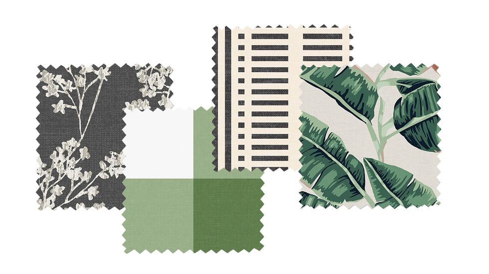
Swatches: Branches by Peter Som, Mint Check, Ink Ivory Block Stripe by Christene Barberich, Banana Palm
“I love to mix pattern, color, and texture. To ensure that this combination was chic, I mixed bold with calming grey tones.” This edited palette enables Banana Palm to really shine. The mint green check plays up the lighter shades of green in the palm print. And while the branches and block stripe make a statement, they take a back seat given their muted color stories.


