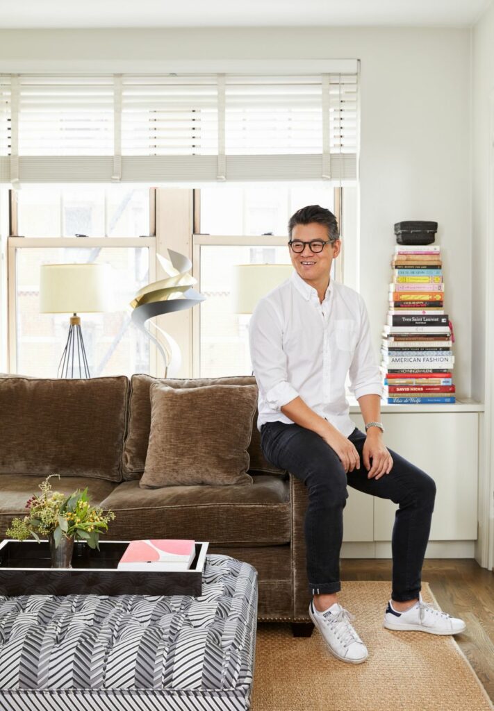
1) CUSTOMIZE PIECES TO SUIT YOUR SPACE
Peter Som’s perfectly appointed living room in NYC
Photo: Gieves Anderson
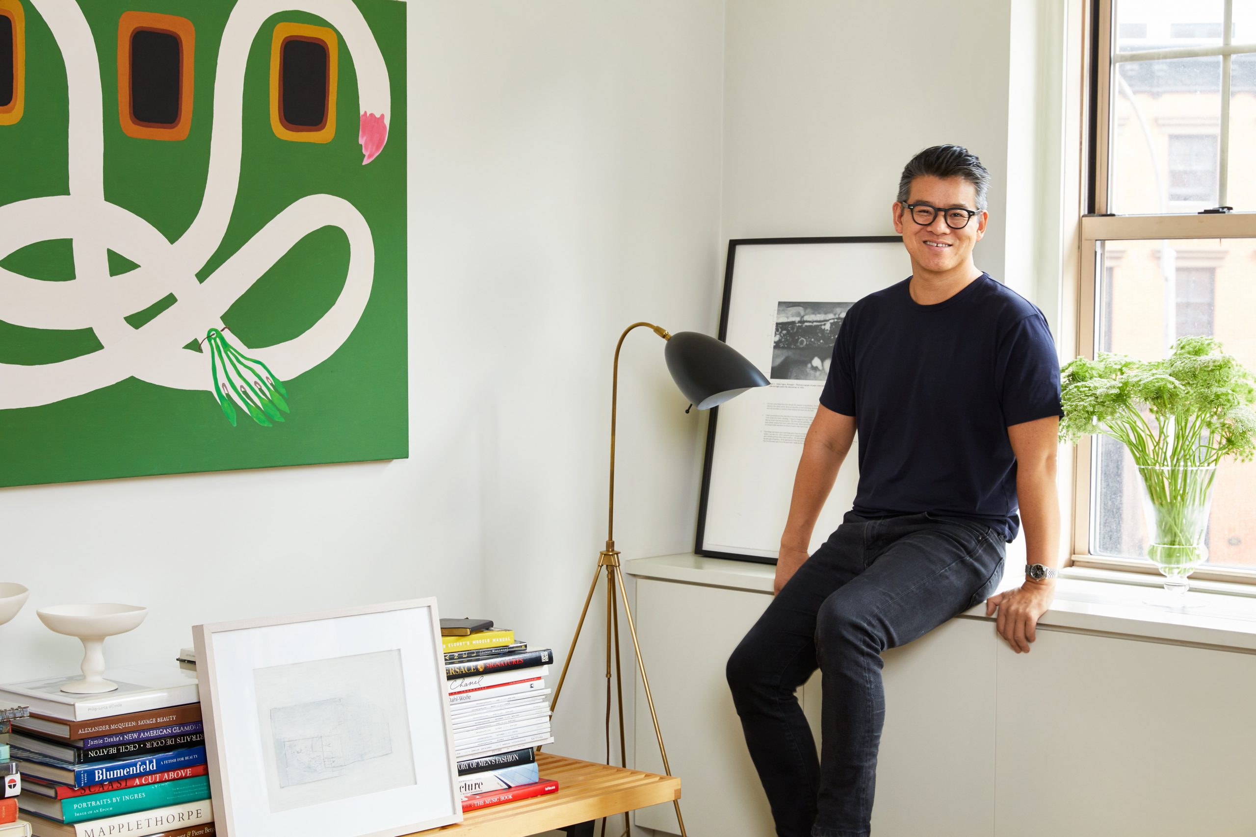
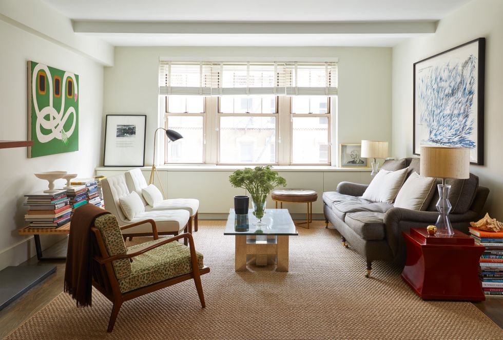
By living in his New York apartment for a decade before renovating—and collecting decor as he went along—fashion designer Peter Som’s Manhattan living room now feels perfectly curated. After finding a brutalist coffee table base at Elizabeth Bauer Designs that he loved, the designer “googled ‘glass top'” to complete the piece. “Don’t be afraid to do thing yourself to get exactly what you want,” he says. “The glass top give the piece the lightness and transparency to balance the space.” Bold green painting by Mia Enell, print on windowsill by Glenn Ligon, and large blue print over the sofa by Raymond Pettibon.
2) START WITH THE SOFA
Photo: Gieves Anderson
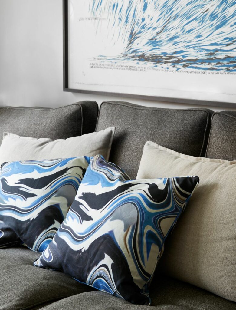
A classic sofa by George Smith was selected for comfort and covered in luxe Raoul Textiles wool silk. “I love the classic men’s suiting feel of the fabric on the sofa,” says the fashion designer, who advises starting a space with the sofa choice (and sitting on it before purchasing!). “The shape is also classic in a modern way, with the sculptural, pleated, rolled arms and a turned leg that gives the illusion that it’s floating. It works everywhere.” The reversible throw pillows are Som’s own design for his collaboration with The Inside, a direct-to-consumer home brand founded by (disclaimer alert) this writer.
3) CONSIDER OUTDOOR FABRICS
Som’s vintage Edward Wormley chairs, covered in Cowtan & Tout outdoor fabric, and painting by Mia Enell
Photo: Gieves Anderson
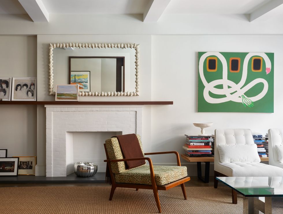
For a crisp, clean note, Peter had vintage Edward Wormley chairs covered in Cowtan & Tout outdoor fabric. “They are white but I can spill wine all over them and just wipe it up,” he says. “I think if you want white, the right performance fabrics make a huge difference.” A side chair by designer Mel Smilow was bought at Housing Works and recovered in leopard Scalamandre cut velvet (“It’s an animal print, which acts like a neutral”). Small oil painting against mirror is by Walter Us, art on mantel at left is by Ajit Chauhan, photos on hearth by Anthony Goicolea, and green painting by Mia Enell.
4) SEE THE POTENTIAL IN AN EMPTY WALL
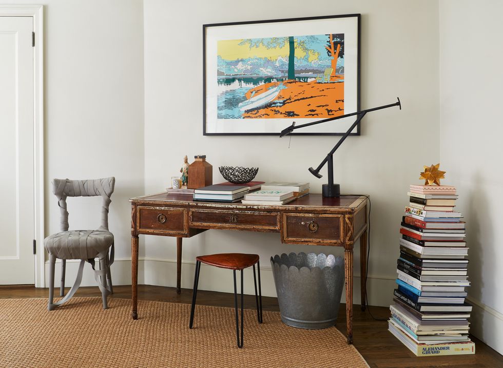
A 1940’s French desk and a midcentury stool complete the space. “It’s all about the low with the high,” Som says.
Photo: Gieves Anderson
The study, the product of some clever decorating on an empty angled wall, is the perfect example of Peter’s genius mix. A “mummy chair,” by designer Peter Traag, “is perfectly sculptural and ever-evolving, as the elastic has started to decay. It becomes something different all the time and that is its beauty,” Som says. In stark contrast, a 1940’s French desk and a midcentury stool complete the space. “I love a hairpin leg and small sculptural stools—they are perfectly functional and decorative…and this stool moves all over the apartment as extra seating.” Desk lamp is classic Tizio; artwork is Lisa Ruyter. In true Som fashion, the space is finished by a large galvanized steel bin from Martha Stewart’s first home collection, which he uses to store magazines. “It’s all about the low with the high,” he says.
5) MIX TEXTURES
Chair by Arnie Norell and artwork by Adam Pendelton.
Photo: Gieves Anderson
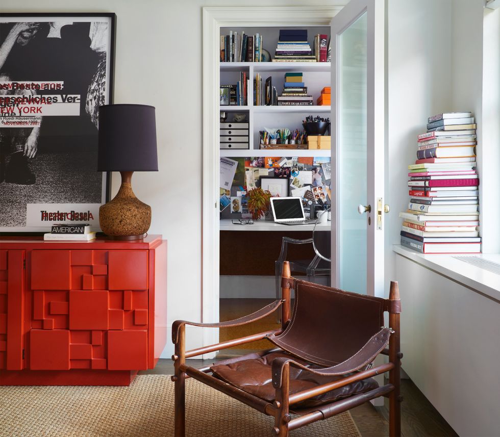
“Like a great red lipstick, all interiors need a pop of red,” says Som, who went with a lacquered chest of drawers from Lane in the bedroom. Chair by Arnie Norell and artwork by Adam Pendelton—and it’s all finished with a vintage lamp from eBay. “I am having a cork moment.” says Som. “I love the texture and color.” Together, the high-gloss and rough natural textures mellow out. Through the doorway, a home office where he designs includes custom millwork and a ghost chair.
6) EMBRACE LOW-TOUCH CUSTOMIZATIONS
The Arthur Elgort photo features Lisa Taylor; French ’40s side tables from 1stdibs
Photo: Gieves Anderson
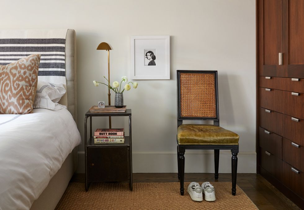
In contrast to a reproduction Louis-style chair that Som made his own with chartreuse leather—”reupholstering can be your friend,” says the designer—a blanket from North and Found Co. was simply draped over an upholstered headboard to give it a new look. The latter is arguably just as impactful as the professional job. The Arthur Elgort photo features Lisa Taylor; French ’40s side tables from 1stdibs.
7) HIDE EXTRA STORAGE WITH A FOLDING SCREEN
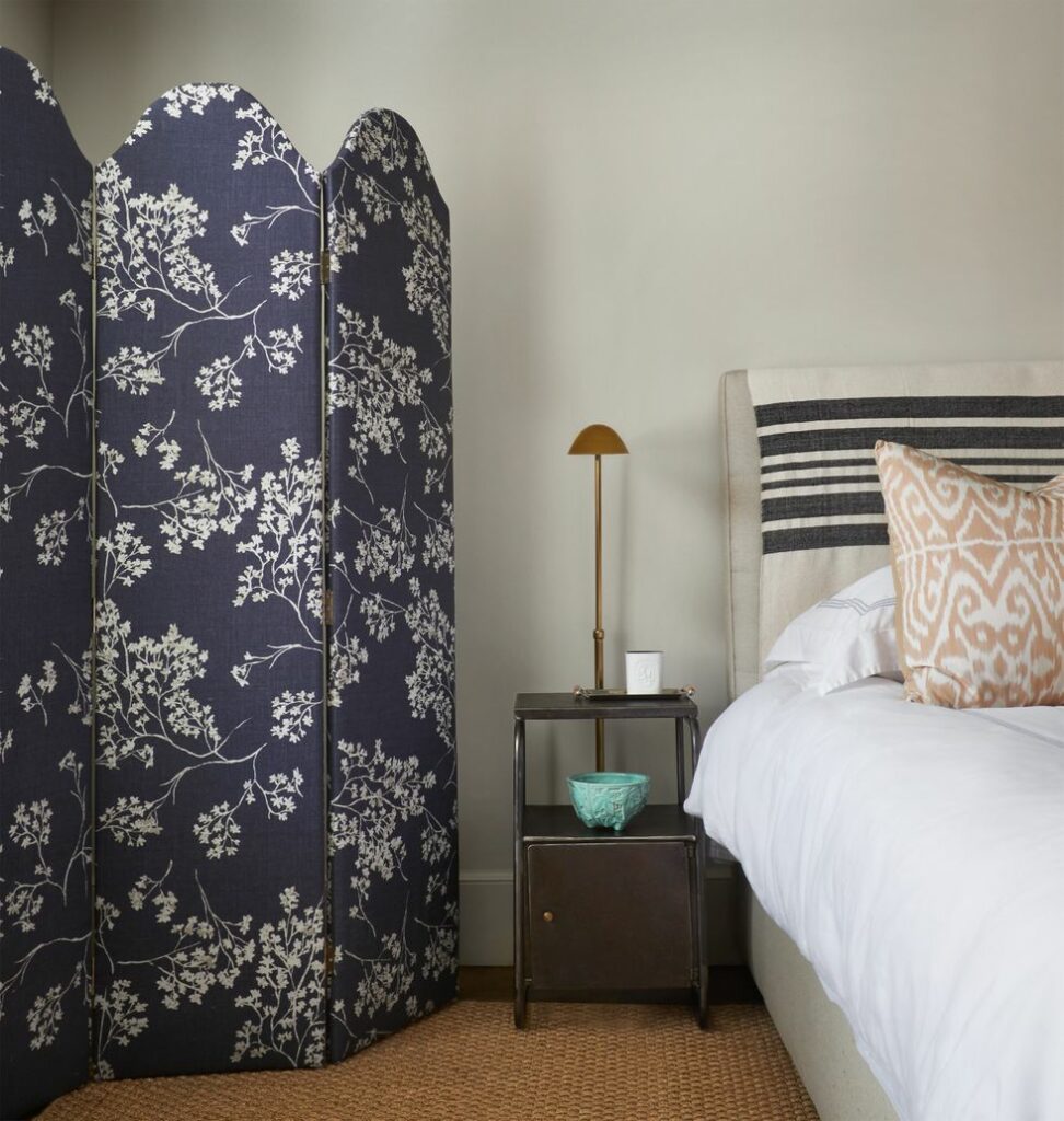
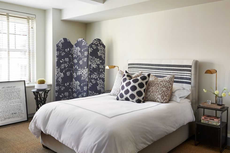
Scalloped Screen in Branches By Peter Som, side table from 1stDibs.
Photo: Gieves Anderson
“I love a decorative screen,” says Som in regards to this piece, which is also part of his collaboration for The Inside. “It’s a great way to both decorate and cozy up a space,” he says. “It’s practical, too—I hide things like boxes—and is a decorative moment for a dead corner that helps with the illusion of height.”
8) RECOVER THRIFT STORE FINDS
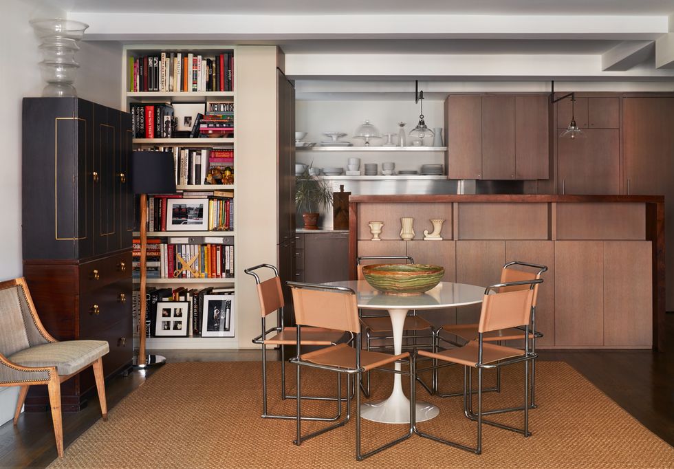
Som’s dining area
Photo: Gieves Anderson
The open kitchen was designed to delineate the space, but flows beautifully into the dining room. The side chair, which Som had always kept because of its lovely shape, is a found piece; he had it recovered in Jack Lenor Larsen fabric. “Don’t be afraid to find something and recover it,” he says. “It’s the easiest and least expensive way to make something personal and really yours.” The secretary, which provides extra storage in the dining area, is vintage Tommi Parzinger; the glass vase on top is by Karim Rashid. Som finished off the space with a dining table by Eero Saarinen; the chairs are Marcel Breuer B5, and the large decorative bowl on table from is from Mecox Gardens.
9) LEAN UP ART
Scalloped Screen in Branches By Peter Som, bed from Mitchell Gold and Bob Williams
Photo: Gieves Anderson
The bedroom is an oasis of calm. “I don’t always hang my art. I often lean it. It feels more casual, creates a sense of ease, and I don’t have to commit,” says Som. The bed, from Mitchell Gold and Bob Williams, is styled with pillows from Madeline Weinrib. The side tables are industrial French from the ’40s, the lamps are from Restoration Hardware, a vase on side table is from Mryth Ceramics, the folding screen is Peter Som x The Inside, and the decorative wood pedestal is from Laurin Copen Antiques. The leaned artwork is Jonathan Borofsky.
10) EMBRACE A SECTIONAL FOR A SMALL ROOM
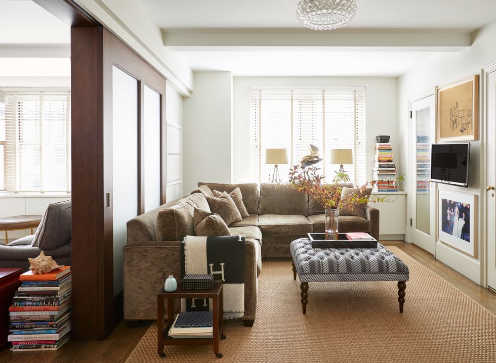
The sectional is custom; The Cocktail Ottoman is in his own collection for The Inside in PS1 Herringbone by Peter Som
Photo: Gieves Anderson
“This is where the Ellen happens,” says Som of his very comfy den-cum-guest room. The sofa is custom, designed to perfectly fit the space, and it folds out into a double bed (in a moment of luxe Som covered it in linen velvet). The artwork above the TV is Kojo Griffin; below it is an Arthur Elgort photo of Peter Som and models that was published in Vogue.
11) OUTFIT AN EXTRA ROOM WITH MULTIFUNCTIONAL PIECES
Photo: Gieves Anderson
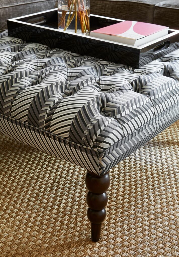
The tufted ottoman is also part of Som’s collaboration for The Inside. “The turned leg gives it the classic nod,” he says. “It’s juxtaposed with a large-scale herringbone that allows for both fun and sophistication, classic menswear with a twist. And it’s also multifunctional, says Som: “I can move it around for extra surface and seating.”
12) DECORATE WITH BOOKS
Photo: Gieves Anderson
“Use books as décor—they work for everything,” says Som, who keeps them in stacks all over his home.

